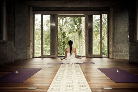
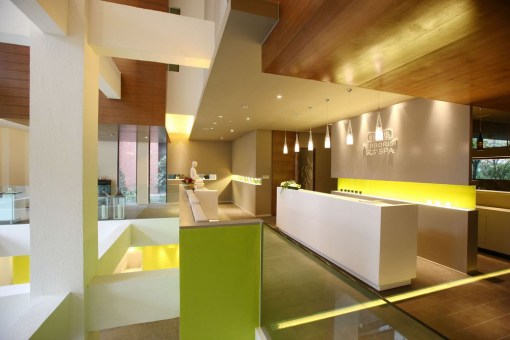
Color is one of the most powerful tools we can use to set the mood of our interiors. It can affect our senses so gently that we hardly perceive it, or hit us so hard that it takes our breath away. So much of what we comprehend is achieved through sight, and powerful memories can be made through the use of light and color. The easiest way to transform your spa’s interior is to buy a can of paint or add a pop of color through accessories. Below you can learn about how different hues affect our moods and senses.
I’ve also put together some great Benjamin Moore paint selections you can use to transform your space. Enjoy!
Indigo & Sky
Blue is well known as a color that soothes tension and relaxes the mind. It brings to mind the airiness of a clear blue sky, or the expansive and deep oceans. It can also suppress the appetite (To those of you on a diet: Eating from a blue plate can help you eat less!), and fuel artistic expression. Blue can help slow people’s heart rate and increase concentration. It can also make a room feel too cold, so be sure to accent this watery hue with warmer tones. This color is also said to enhance communication, reduce anxiety, and help provide restful sleep. It’s a good color to use in treatment rooms & pedicure areas to calm your guests and help them feels at ease.
Plums & Purples
Light purple tones and lavender are known to enhance spirituality and wisdom. It’s also a very feminine color, and is known to reduce stress. Deeper hues of purple are associated with royalty and creativity – it’s even been said to make people more arrogant! Use deep purples as an accent in your spa’s relaxation areas to make your guests feel like royalty! Lighter tones of lavender and lilac provide a serene atmosphere in meditation areas & the yoga studio.
Sage & Moss
Green hues are said to be calming and soothing IF you choose the right shade. Bright lime green, for example, can be cold an unwelcoming when it’s not used sparingly or in the right application. Soft and warm green can create a calm and restful atmosphere – just imagine a walk in a lush forest. This color is also linked to harmony & balance. Use throughout your spa’s interior to add a peaceful feeling. Using natural materials like moss in your retail displays will draw your customers eye & add a pop of natural green without being overwhelming
Sunshine & Chartreuse
Only the boldest of the bold can handle a bright yellow room! This color is linked with happiness, energy, and warmth, but too much can cause irritability and has been said to worsen some medical conditions (Check out the book “The Yellow Wallpaper” by Charlotte Perkins Gilman for a story about too much yellow). In small doses this color can add that little touch of sunshine that we all need every once in awhile. Use within a pattern or in thoughtful accents to lift spirits and energize a room. Some well placed yellow accents in retail area signage will really grab your customer’s attention.
Petals & Perfume
Oh pink, you’re so girly! I have to admit that pink is one of my favorite colors – it comes in so many hues and variations from peachy to bold and fearless fuchsia! It also adds its own unique warmth and comfort to a room. While pink is mainly associated with all things feminine it also offers stability, reassurance (think: Mom), and romance. It also curtails aggression and provides a cozy sense of calm.
Fire & Spice
Bold and boastful red can easily overwhelm a room. This color has been know to increase the heart beat, increase energy, and therefore cause aggression. It also helps increase your circulation, willpower, and even your libido. Adding some red in the right place can add energy and warmth to your room. It also encourages people to eat more and socialize, perfect for a bustling spa cafe or as an accent in your spa’s party room.
Citrus & Nectar
Orange tones are often associated with joy and optimism, and can help to combat depression. Beware of using to much of this sunny hue, though – an overdose of orange is said to cause pessimism and drowsiness. This tone is linked to warmth, stability, and reassurance. Some say it even aids in digestion. Use it in areas where you’d like people to buy and go – your storefront spa cafe, spa makeup area, or in accents in your retail checkout area.
Cotton & Clouds
White embodies ideas of purity, cleanliness, and serenity. White rooms layered with lots of texture can be some of the most comforting and calming spaces. It provides a great, clean backdrop for displaying merchandise with bright colors, and give a pure sense of cleanliness to your spa rooms. If your lighting is too bright or your space doesn’t have texture, white rooms can easily become too sterile and bright if proper lighting and layering isn’t introduces. Make it work for you by adding hints of your favorite colors throughout and utilizing architectural details in your interior.
Cashmere & Chocolate
Neutrals & browns ground your space and provide stability & security, much like the strong and mighty oak. Introduce brown tones to your relaxation areas through the use of natural wood, warm toned fabrics, and grassy textures. Brown is also a great color to balance green, blue, and lavender hues and bring these dreamy tones back down to earth.
Charcoal & Twilight
Sophisticated, sultry, and moody! Black is best used as an accent color, and is another great shade to help you bring depth and drama to your space. Use matte black shelves to make light, bright art pieces and retail stand out, or add a black table to your lounge to add depth. Black can easily become dark and dreary and make a room feel closed in, but with the right layering of texture and color a black room can make a dramatic, memorable statement.
For more on spa design: Click Here


